Colorado Landscape Inspires Colors For The Home
A lot of interior designers and design bloggers often mention to “turning to nature for color inspiration.” However this may be true, finding your color palette from the outside world can be hard to do if you’re not well versed in color theory, or even if you’re not completely decided on a design style!
Now that color has officially made its comeback, I’d love to share a few of my favorite nature-inspired color palettes, which also fall under Pantone’s New York Fashion Week Color Guide 2018!
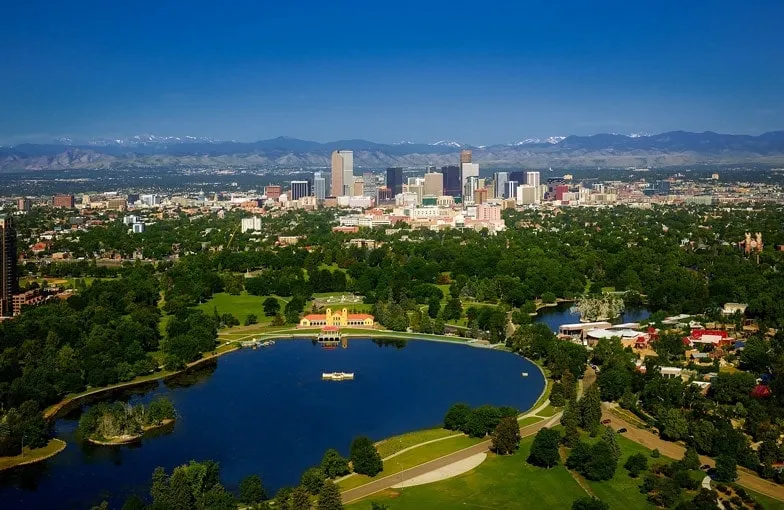
Denver, CO
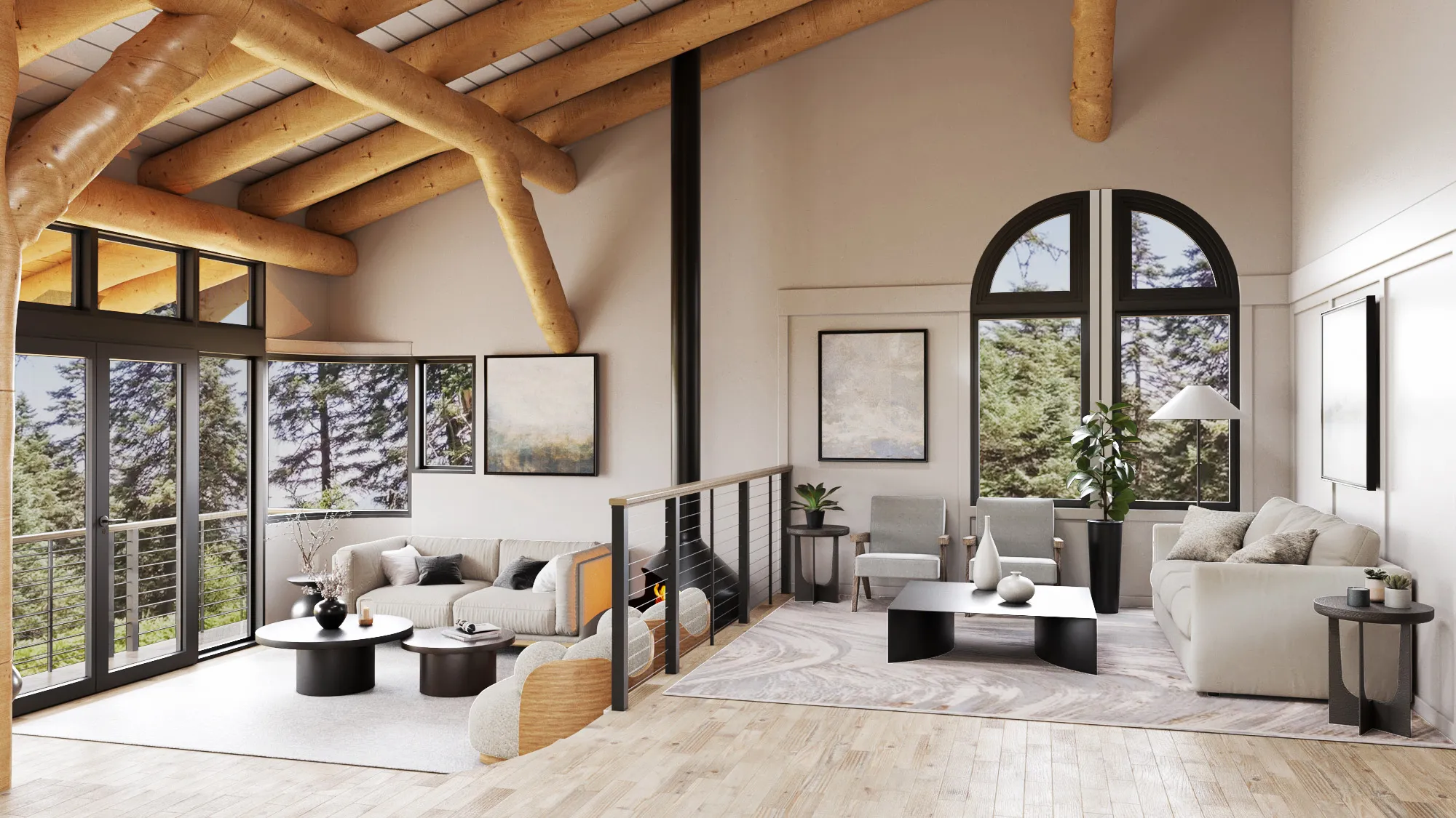
While bright green and blue is a color match made in heaven, and one of the first “nature-inspired” palettes that come to mind, one doesn’t want to go over the top with these hues. I like seeing this color combo used as accents, especially when seen against Pantone’s list of “classic spring colors,” such as Warm Sand and Harbor Mist.
Silverthorne, CO
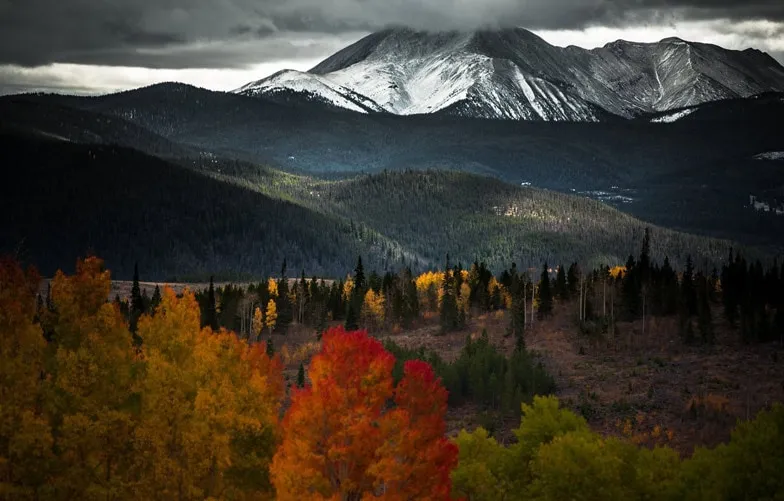
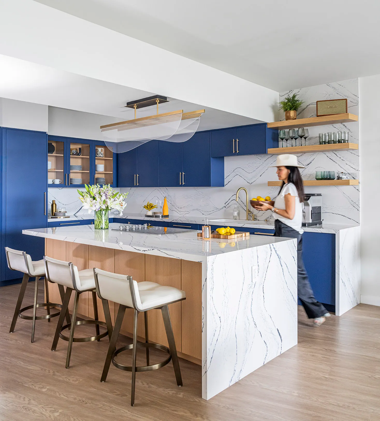
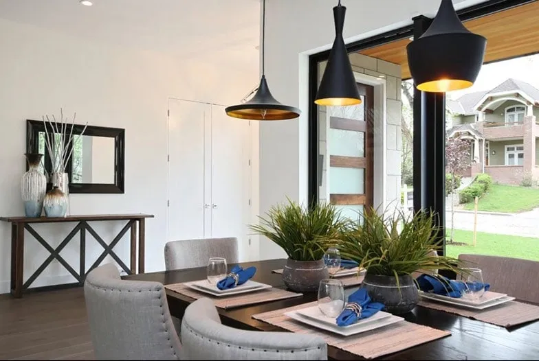
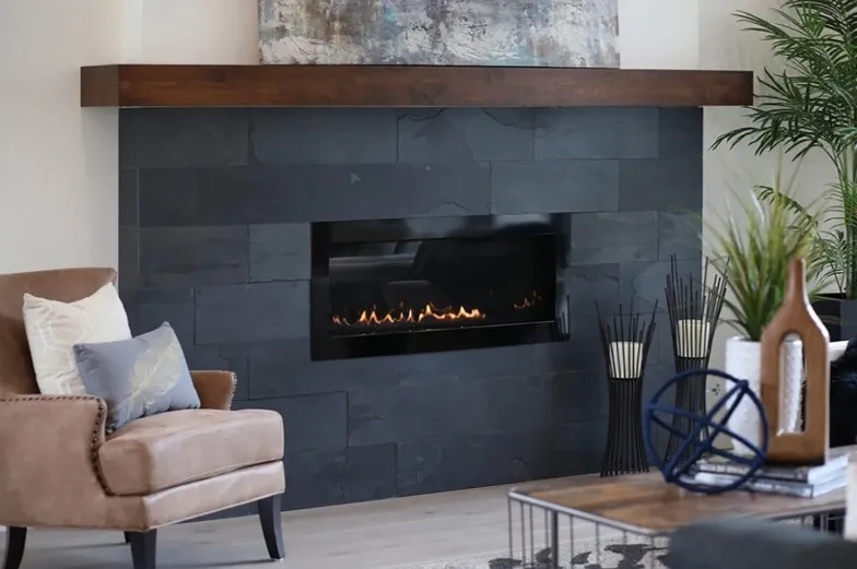
Hints of rich orange and yellow, such as Pantone’s Chili Oil and Meadowlark, look dazzling against moodier shades. Dark charcoals, matte blacks, and metallics really make these accent colors pop. A lighter neutral like Almost Mauve or Coconut Milk will create a harmonious transition between the contrasting bright and dark hues.
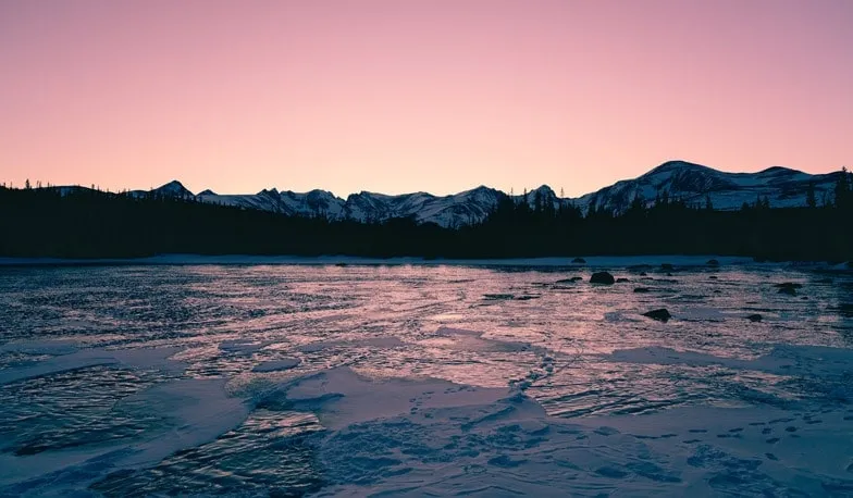
Colorado Storm
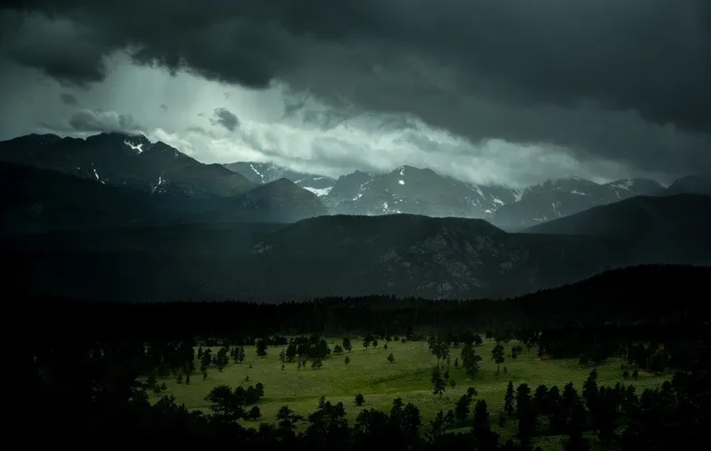
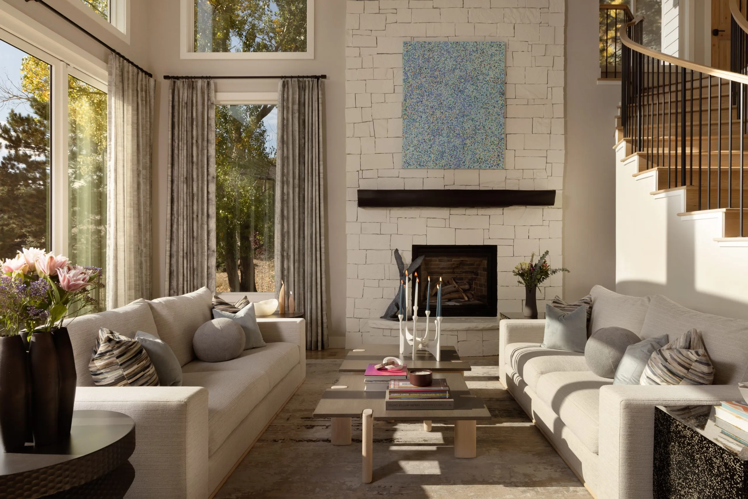
A close relative to the above blue and green color scheme, this color palette takes on a more dramatic look and feel. Using darker shades, such as Sailor Blue and Emperador, will create a warm and sophisticated aesthetic. Matte black accents and dark leafy house plants will accentuate the thunderstorm feel, creating a cozy chic interior design- similar to the calm before a storm.
Red Rock Lake, CO
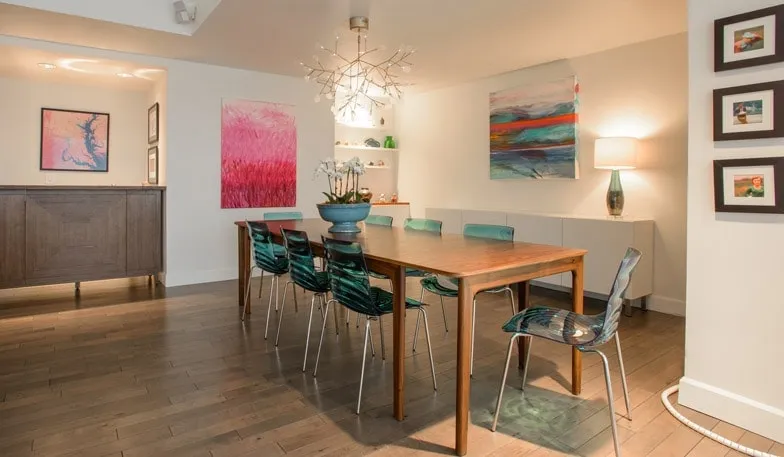
This whimsy color palette is soft, playful, and feminine. Working with pinks, blues, and neutrals, the result is a showstopping combination no matter if you decide to use saturated or pastel hues. Pink and blush shades such as Pantone’s Blooming Dahlia, Pink Lavender, or Spring Crocus will set the overall tone and contrast against more neutral shades of Harbor Mist, Coconut Milk, and Almost Mauve. Add an additional accent, such as green Arcadia, for a more balanced feel of masculine and feminine elements.
Mount Eva, CO
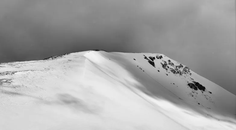
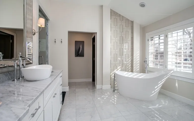
And lastly, a soft white and ivory bathroom is the perfect place to reflect Colorado’s snow-capped mountains! Bright whites paired with Coconut Milk and Harbor Mist will bring out the feel of a crisp winter’s day, while metallic accents will add contrast and unique finishes and feature walls will create depth and texture!
Hope this imagery of beautiful Colorado guides you in finding your own nature-inspired color palette! From bright and bold to dark and dramatic, and everywhere else in between, nature is an inspiring place to turn to when deciding on a cohesive color scheme.
If you need help deciding on hues for your Colorado home, which depend on space, location, layout, and lighting, feel free to give us a call, 720-735-7533
We would love to help!